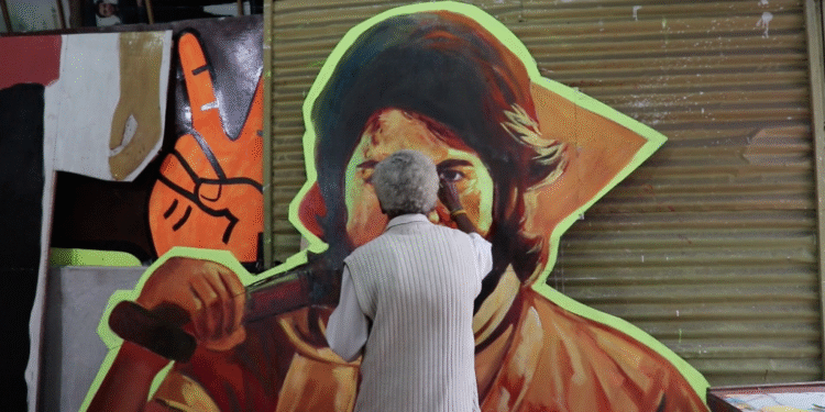
In a world dominated by digital design, sleek graphics, and Photoshop-perfect aesthetics, one artistic relic of the past stands as a powerful symbol of cinematic romance: the hand-drawn movie poster. These lush, imaginative, and intricately crafted artworks once served as the first point of contact between audiences and the films they came to love. But in today’s age of templated blockbuster marketing, they’ve all but disappeared. This article explores the rise, fall, and lingering soul of hand-drawn movie posters — and why their absence has left modern film culture visually poorer.
The Golden Age of Movie Posters: When Art Met Cinema
The origins of the movie poster trace back to the late 19th and early 20th centuries, but the real “golden age” began around the 1920s and flourished through the ‘80s. Before the advent of widespread color photography or computer graphics, studios hired illustrators and painters to capture the essence of their films through brush, ink, and paint.
Artists like Saul Bass, Drew Struzan, Bob Peak, and Richard Amsel became legends in their own right, their work often as iconic as the films they promoted. A Saul Bass poster wasn’t just advertising; it was visual poetry — minimalistic yet deeply expressive, distilling a film’s themes into a singular, striking composition. Meanwhile, Struzan’s richly detailed, hyper-realistic paintings gave life to the likes of Star Wars, Indiana Jones, and Back to the Future, giving audiences a visual narrative far before the opening credits rolled.
At their best, hand-drawn posters weren’t just marketing tools — they were an art form.
Storytelling in a Single Frame
A hand-drawn poster had one job: to seduce.
It had to ignite the imagination in seconds — to suggest a plot, tease characters, and hint at genre, all within one visually arresting frame. These weren’t just representations; they were interpretations. Artists used visual metaphors, surreal compositions, and exaggerated color palettes to mirror the emotional tone of a film.
Take the poster for Raiders of the Lost Ark (1981), drawn by Struzan. Harrison Ford’s Indiana Jones stares out confidently, whip coiled and ready, framed by artifacts and ancient ruins. The poster doesn’t just show you what happens — it feels like an adventure. Or the haunting image of Rosemary’s Baby (1968), a minimalist green hue with a baby carriage atop a hill and Mia Farrow’s face looming like a spectral presence. You know from just one glance: this movie is going to mess with your head.
Hand-drawn posters had atmosphere. They had mood. And most importantly, they had personality.
The Death of the Brush: The Rise of Digital
So what happened?
Technology happened. As Photoshop and digital photography became the industry standard in the 1990s and 2000s, studios leaned toward efficiency, reproducibility, and control. Why wait weeks for an oil painting when you could knock out a high-resolution digital poster in hours? Suddenly, posters became formulaic: a floating head collage here, a dramatic color gradient there, generic sans-serif fonts everywhere. They began to look more like product packaging than works of art.
Moreover, the rise of global marketing campaigns required that posters be easily adaptable for international markets. A photographic poster of a Marvel superhero could be tweaked to include Chinese characters and still make sense. But a hand-drawn illustration steeped in one artist’s stylistic vision? That didn’t translate so well across borders — or so the studios believed.
The result was a slow but sure death knell for traditional poster illustration. And in its place rose the modern blockbuster aesthetic: generic, shiny, and utterly devoid of soul.
The Culture Shift: From Collectible to Content
Hand-drawn posters weren’t just art — they were collectibles. They were treasures that fans hung in bedrooms and framed in dens. You didn’t just watch The Empire Strikes Back — you lived with it, in the form of a poster that radiated your fandom to the world.
Today, posters are more like content. Instantly consumed and forgotten in the digital scroll. Even teaser posters for billion-dollar films get lost in the algorithmic void of Instagram and X (formerly Twitter). In this new economy, the image is disposable — not enduring. And that’s a damn shame.
Gone is the thrill of discovering a poster that speaks to you on an emotional or aesthetic level. Instead, we get faces, explosions, symmetry. They all look the same — and that’s the point. The focus is brand consistency, not creative expression.
Indie Resistance and the Return of the Craft
And yet… like all good stories, there’s a twist.
The hand-drawn poster isn’t completely extinct. In fact, it’s been quietly making a comeback, thanks to a new generation of indie filmmakers, boutique studios, and passionate fans.
Companies like Mondo, Vice Press, and Bottleneck Gallery have built entire ecosystems around reimagining classic films through limited-edition illustrated posters. These aren’t just nostalgic throwbacks — they’re stunning reinventions. Artists like Olly Moss, Tyler Stout, and Laurent Durieux have found fame in the film art underground by proving that illustration can still command respect — and, importantly, money.
Many of these posters sell out within minutes, becoming high-value collector’s items. In this world, the poster is revered again. It’s framed. It’s discussed. It matters.
Even some studios have taken notice. Films like The Babadook, La La Land, and The Grand Budapest Hotel received special-edition illustrated posters — and audiences loved them. Why? Because they stood out. They evoked emotion and invited interpretation.
Why It Matters: Beyond Nostalgia
This isn’t just about aesthetics. It’s about what kind of culture we want to live in.
Hand-drawn posters remind us that film is an emotional experience, not just a transaction. That art should be surprising, risky, and personal — not just test-marketed to death. And that sometimes, one person’s hand and imagination can convey more than a team of digital designers working within a corporate style guide.
More than anything, these posters are time capsules. They capture not just what a movie is about, but how it felt to be alive when that movie was released. A 1970s poster for Taxi Driver isn’t just promoting a film — it’s dripping in the paranoia, grit, and angst of its era. You can feel it. You can smell it.
Today’s posters? They feel like commercials.
Teaching the Next Generation
If there’s one glimmer of hope, it’s that the appreciation for this lost art form is growing. Art schools are beginning to include vintage poster studies in their design curricula. YouTube channels and TikToks dedicated to poster art restoration and analysis are gaining traction. Gen Z, ever the generation of aesthetic revivalism, is falling in love with retro design.
There’s also a growing call for studios to invest in alternate promotional materials — letting illustrators create “artist series” posters that live alongside traditional ones. This kind of dual-track marketing could be a win-win: giving the mainstream audience what it expects, while also serving the cinephiles something they crave.
A Call to Brush
Cinema is — and has always been — a fusion of art forms. Visual. Narrative. Sonic. Emotional. So why shouldn’t its advertising be just as expressive?
The lost art of hand-drawn movie posters is more than a footnote in design history. It’s a reminder of what movies can be: dreamy, daring, mythic. These posters didn’t just sell tickets — they sold magic. And in an industry increasingly driven by algorithms, budgets, and brand synergy, we could use a little magic.
Let’s bring back the brush. Let’s welcome the mess. Let’s give future generations something worth framing.
Because cinema deserves more than a Photoshopped face.
It deserves a vision.


